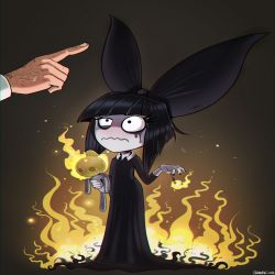
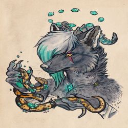
More artworks made by didier1961
Comments
-

-
Nicolas Sepulveda 16 Mar 2016
Not bad, though you could work on the structure of the face more to vastly improve it.
-
ScarlettWolf24 16 Mar 2016
The shading is really nice and smooth on the face, however I believe the nose is a bit too wide compared to the rest of the face. The right eye is also a bit bigger than the left which is slightly unproportional. The shading on the hat should have more shadows, and creases so it falls in a natural shape. The chain is also slightly bigger on the right than it is on the left. Overall it is really good with some slight improvements that could be made. Great shading of the skin!
No comments.


