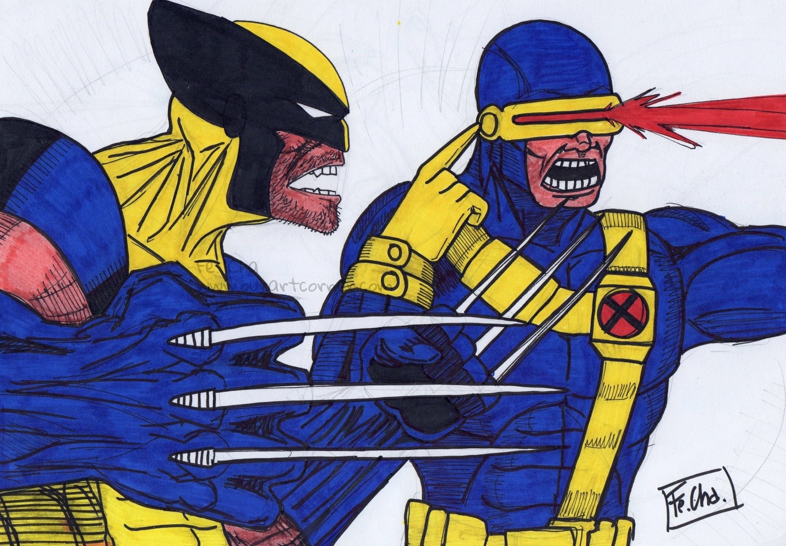
wolverine & cyclops
 Twitter
 Pinterest
Comments 8
-
0 replies
-
Nice work. Keep progressing.
0 replies
-

Good job!
0 replies
-

nice colors
0 replies
-

Awesome work :)
0 replies
-

Crudely cool!
0 replies
-
Wow. Good linework, and coloring. The tendons of the neck, and hands seem over defined, but it's fitting considering thats the dominant style of comics. The abs on the other hand seem rather flat, and wide, and the pectorals too square. I personally never draw muscular figures since I hate all the detail, and work it takes, but if thats the path you'd like to take in your art, I'd advise you to look at A LOT different photos of muscular men, and woman to get a better idea of what well rounded, sharp, and defined muscles look like. Looking at human anatomy cut aways of muscles, and tendons can give you a more intuitive sense of placement, proportion, and shape. I hope thats helpful!
0 replies
-

well done! :)
0 replies
No comments yet. Start the conversation.
Really great love the colors:)