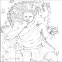
Back then...was it despair?
Description:
Updated Black & White version, which is a bit darker than the first one.
Comments
-
numer23 19 Jul 2015
Nice :)
-
Jose850 2 Jul 2015
amazing
-

Anonymous 16 Jun 2015
I think it looks good, but the nose looks a little off, in my opinion. Everything about your picture is good, but try working on the nose. :)
-

Anonymous 16 Jun 2015
nice
-
blank 16 Jun 2015
Nicely done. The hair is great
-
bielebny 16 Jun 2015
good!
-
MKIII & AV59 16 Jun 2015
style Beach j'aime bien
-
Drachul 16 Jun 2015
Looks quite nice, best feature is the hair. But try to make the hand seem more natural. Way to do this would be to use more shading (more detail) on the palm of the hand. Also, draw the fingers a bit bigger. For a drawing like this you can easily use your own hand as a model, it helps a lot.
No comments.


