
More artworks made by PsychoZH
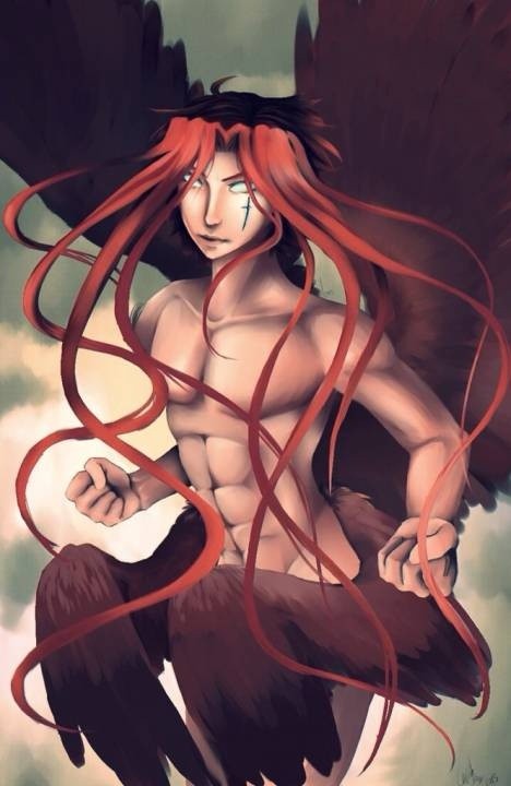


Archangel of Time
Description:
Finally finished this guy, he took forever because I'm still learning what digital art has to offer. The only I really dislik in this is the way his hands look. Other than that this is my oc the archangel Irryth.
Challenge: Sprisenberg VS PsychoZH
Comments
-

Doodle-For-Adventure 25 Aug 2015
Really cool I like the way the chest is drawn:)
-

fastleppard 25 Jul 2015
This is very nice in the way of colors and shading , but the proportions and the anatomy is not so well fitted ! Five stars !
-

Eddieblz 2 Jul 2015
Over all pretty well done. Technique very good. But there is something wrong with the abominable muscles. But then again maybe because he is some type of new creature and not a human this is the way he looks. Anyway still a pretty nice piece.
-

Mifmemo 20 Jun 2015
I kinda love the butt wings. They really make me smile. I saw below a lot of comments about the abs and I have a link to a pretty good tutorial for that http://thepunchlineismachismo.com/images/abref.jpg Maybe it'll help you. I Really like this picture a lot though.
-

Rinjichan13 12 Jun 2015
I love the saturation of color on this piece and the shading is great! However i agree with z4m97 on the abdominal muscles and how they are structured. I would recommend looking up Human anatomy muscles, to help with that. That is what i did, when i wanted to improve my forms and it really helped because when you know where the muscles are (same goes of the human skeletons), it really helps with poses. Now i know the structure by heart and its easier. So yeah, great job! :3
-

z4m97 11 Jun 2015
an icon is basically an idea of the real thing, like using dots to represent eyes, they arent eyes, but you interpret them. the problem is when you dont know where those icons came from you cant really notice when you got it realistic and when youre using icons...
-

Sprisenberg 11 Jun 2015
Congrats on winning the challenge, you deserved it!
-
z4m97 11 Jun 2015
you got the painting right, and the right hand looks pretty cool, also the composition is kinda neat but id like the hair to be more flowy towards the side, not just downwards. the anatomy however, needs some work, you get the idea of what they are but you dont really think of the structure of the muscles. youre using a lot of icons so when youre starting out and you dont know what the real thing looks like its a problem to rely on icons, so my advice: study from the real thing, im not telling you to go reallistic, but to apply hat you learn from your life study to your stylized art. hope it helped and happy drawing :D
-
Sprisenberg 11 Jun 2015
Wow Physco, that's some nice work you have created. I love the shading and background. Good Luck on the challenge!
-

Anonymous 11 Jun 2015
great work :)
-
ArTRefugiuM 11 Jun 2015
Great! :)
No comments.