Green Arrow

 Twitter
 Pinterest
About this artwork
Green Arrow
Challenge
JPW Artist vs Josiel RodriguesComments 9
-
0 replies
-

The attention to detail is impressive, I really like how you did the musculature on the arm. However, it seems that the overall sense of form has been forgotten, removing any sense of overall depth to the picture. Next time, try starting with the overall shape of the figure, then work your way towards more detail.
0 replies
-
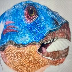
Great artwork :-)
1 reply

http://ourartcorner.com/group-battle/570/double-exposure-VS-kate-work-in-progress
-

The hoody looks a bit weird, it looks like foam than fabric. A little more detail around the face would nice, maybe more shadow or cross hatching to give it that human skin texture. Try to get rid of the outline of the hoody around the flowing hair section because it is a bit distracting. The arm seems to be too buffed, it looks like he is on steroids. Finally, there is not really an arc to him, he is so flat, but maybe have the chest stick out and push back the crouch area or the other way around.
0 replies
-

well done !!!!!!!!!!!!!!!!!!
0 replies
-

Nice work. ^^
0 replies
-

nice i like you style of work
0 replies
-

Very nice!!
0 replies
No comments yet. Start the conversation.
Really loving the shading and the pose. He looks killer and just fantastic overall, really well done :)