Comments
-
MKIII & AV59 13 Apr 2017
Keep it up ^^
-
Inuyashalh7 14 Jun 2017
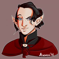
The darkness of the background doesn't help to bring out the characters more proficient features, and the head seems to be leaning just a bit more to the left than the right, don't know if that was planned but it stands out. Some colors would make it pop more.
-

Anonymous 19 Jul 2016
I like the depth you put into it :O IT LOOKS AWESOME!!!
Arcussi 19 Jul 2016
I'm glad you like it! :D Thank you. :)
No comments.


