Comments
-
trevorp 21 Mar 2016
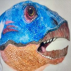
Nice colourful artwork with interesting design.
-
Ravence-Sketching 23 Mar 2016
I really like the colors and the style a lot. Something that can be improved is your horizon. It wouldn't go into the vanishing point like you portrayed it. It should actually be completely horizontal, and is where the vanishing point would be on. Maybe look into perspective a little more. Specifically "one-point perspective" which is what you have. I would also suggest to add a little reflection in the water. It could really bring the drawing to life. This is a great start and don't stop here, practice some more and try to improve. Best of luck to you.
-

Anonymous 21 Mar 2016
Nice colors!
-
mahmoud 20 Mar 2016
Goooood
No comments.


