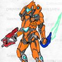
Thanks for asking me to make a critique on your Drawing, first of all the anathomy is very well done, the efectos on the feathers are well handled specially the Black areas. These would be My recomendations: Define where the ligth come from, on head it seem it come from its left side but looking at its chest it Seems to be on the other way. Eyes are very mportant, i recomend to use High contrast, since it barely can be seen on him, for getting High contrast i use markers in eyes eventhou i would be Drawing with pens or colors. Try to apply more color (yellow/blue) on the area that is farest to the ligth, your colors are so transparent, more opacity on color Gives life and depth. Beak need more contrast as well, remember that is a diferent texture from feathers, specially on nose holes it needs opacity and contrast. I think beak needs some white where the light come from (on its top side) I usually color from lightest to darkest color, but, white at the end to magnify brightness Try to use brown on dark sudes of the yellow area and Black on the blue area. I hope this comment May help on your work, im open for any comment you have. Thanks again for the oportunity to talk about your work
More artworks made by Cyanide4312
Critiques
Challenge: Cyanide4312 VS Oscarlira
Comments
-
Michelle Nguyen 9 Jan 2016
you've done a really good job on the markings. they look very real
-
Cyanide4312 11 Jan 2016
Thank you for the advice. I really appreciate you taking the time to show me what I can do to improve! I will definitely keep the lighting in mind on the next drawing.
-
Justinnator4 13 Dec 2015
That's quite an elaborate bird.
-
Global125 22 Feb 2016
www.globalcompanyformation.co.uk
-

Anonymous 13 Dec 2015
A beautiful clean image of a budgie. Great technique.
-

Anonymous 13 Dec 2015
Cute.
-
Valkarya 13 Dec 2015
good !
No comments.


