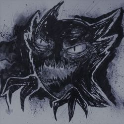
More artworks made by Oscarlira
Challenge: Kana Go VS Oscarlira
Comments
-
blvckink 15 Jul 2015
would be a very cool comic illustration :D
-
IsidoraN 15 Jul 2015
great job
-
cardentist 15 Jul 2015
Ah sorry I didn't see that you'd responded for a while ^^ I noticed that the gun in particular is very flat looking. Adding some darker shading would help make it look more three dimensional. Other places like the hands and face have a better use of value scale, but would still benefit from some darker shadows.
-
cardentist 15 Jul 2015
This looks rather nice! You have excellent line art and form. There are certain areas that would benefit from more attention to shading and value scale, but all in all this is a fantastic piece!
-
kestraelflight 15 Jul 2015
I really like the dynamics to it. Really makes it seem like there's a story to it (:
No comments.


