
More artworks made by KATENORTH


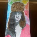
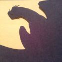
Challenge: blvckink VS KATENORTH
Comments
-

EKA 19 Aug 2015
why so small?! would love to see it in HD :P
-

Puma_Warrior 16 Jul 2015
it looks good but try adding more contrast to the face and the wings. than it looks perfect (:
-
CVAH 24 Aug 2015
I really like the colors
-
Carbon2Tree 4 Aug 2015
Cool concept! The shading creates an interesting texture, but doesn't create as much depth as it could. The face is somewhat lost in the wing. Exaggerating shading to create greater contrast between the face and wing could work. I like the energy and colour pallet of this piece. :)
-

SarembaArt 29 Jul 2015
You have to practice a bit more, dear! :)
-

Eddieblz 6 Jul 2015
Nice work.
-

Sprisenberg 6 Jul 2015
Looks great, next time try adding more contrast to the face and the wings. It is kind of hard to differentiate between the two. Nonetheless, this is very impressive!
No comments.