More artworks made by Kim yaku
Comments
-
Nathan 13 Jun 2015
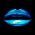
This is nice, I think it could have done with a bit more detail in the eye itself and maybe blend the surrounding colours a bit more. Well done!
-

Anonymous 13 Jun 2015
This Looks to me to be pale. More Contrast please.;)
-

Anonymous 13 Jun 2015
Good attempt at making it look electrif-eyed!
-
SarembaArt 13 Jun 2015
Nice concept! :)
No comments.


