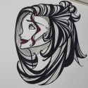
More artworks made by violetmarie2
Comments
-
Khranos 11 Jun 2015
I think it looks rather nice! However, it seems that our right (the panda's left) side is a bit off in terms of the angle and shading of the paws. I think that if they were to be "tilted" a bit farther outwards and have a bit more shading (not much) around where the tip of the paw ends, they would look a bit more realistic. Otherwise, the fur quality is nice, adding a really light grey "fur coat" over the white would probably bring the piece out a lot more. In summation, only very minor issues persist. It's a lovely piece.
-
Onimaster8 11 Jun 2015
Try doing larger works :D
-
Zaela09 11 Jun 2015
Oh good this is sooooo sweet :3
No comments.


