
More artworks made by PsychoZH
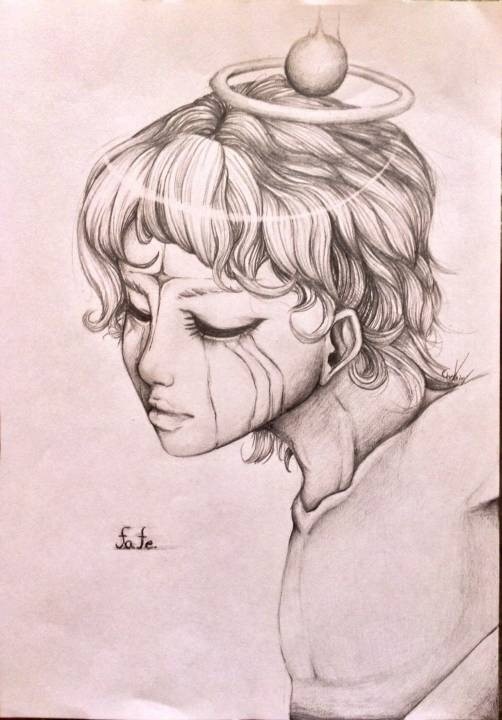


Fate of an Angel
Description:
A quick 30 sketch of my oc angel named Rythz. As much as I feel like I did the shading correct, I still make mistakes a crap ton. Can someone give some tips with pencil shading? :3 it would be awesome! Deviantart account- ProjectPsychoZ
Challenge: PsychoZH VS iqbal tofani
Comments
-
Art is life 13 Apr 2016
Extraordinarily nice !!!
-
FaerieWarrior 16 Aug 2015
love the design and the shading =3
-

UnfadingDreams 14 Aug 2015
I love it
-

Mayrecastro 12 Aug 2015
It's pretty good.
-

ioumx 2 Jul 2015
I think your shading seems to be quite good already, One thing to keep in mind is just remember where your light source is. If you want to show the light source also is brighter, you can shade darker on a particular side.
-

Esa 5 Jun 2015
The Shading itself looks very good, and the contrast in the hair is really good. the only critique I can give about shading is follow where your light source is more. I also love your style, and to go farther with it, just keep working on your anatomy, that can also help with defining light. Hope this helped :)
-
Debby-Chan 4 Jun 2015
It's nice.
-

TKOVENOM 4 Jun 2015
its a very decent drawing
-

LLLUC 4 Jun 2015
This drawing ia already very good! I like it! It depends of course where the light comes from. In your drawing the light comes from the front, so in the back of the neck should be more shadow. and maybe just look at some portraits but there are more curves and recesses in the face that could shadow. Like at the eye or behind the hair. I hope i could help you! (sorry for my english! I hope you understand everything)
-

Slag6 4 Jun 2015
I think it looks great. I think if it were taken into a program such as photoshop and touched up a big (To remove the paper texture/graphite smudges around the painting and also desaturated it would look GREAT! The drawing looks fine as is. I think it doesn't need to be smudged. :p
No comments.