More artworks made by RollieBangBang
Comments
-
lululu174 16 Jan 2015
<3 so cute
-
leesten 14 Jan 2015
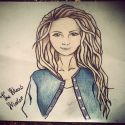
nice work, but shading is something you should definitely work on. The two eyes also seem to be the exact same size even though he's looking with a slightly turned head, which would make the eye covered by the nose smaller.
-
seiya13 13 Jan 2015
nice work! :D
-
The Meow Maker 13 Jan 2015
It doesn't need criticism, you need to work work and work
-

Anonymous 13 Jan 2015
I think the shading is great, but the rest of the face seems mildly... off. Like, it looks weirdly artificial, but I can't quite put my finger on why. Maybe it's because I feel like the lines are a little too solid and perfectly rounded- doesn't quite look human. Maybe making the lines more subtle and light would make it seem a little more natural?
-

Anonymous 13 Jan 2015
you have a good idea about proporcion, keep working so you can get better
-
Wallace Arts 13 Jan 2015
nice
-

Anonymous 13 Jan 2015
Not too bad!
-
TPersaud 13 Jan 2015
Your face proportions are very nice! Try going darker in some areas and add more variety of values to the hair and shirt, that will really spice it up! Art on!!
No comments.


