Tattoo design

 Twitter
 Pinterest
Comments 10
-
0 replies
-

Nice work
0 replies
-
Very good and nice
0 replies
-

very good work, excelent design, a interestant concept
0 replies
-
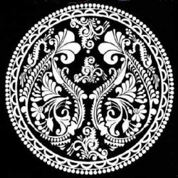
Yeah its problem with the camera. Moreover, all these black gels sketches I do in office in spare time at my desk. So I am in a hurry to take pics to avoid eyes.
0 replies
-

LIttle blurry oh wait that is the camera or is that how it's suppose to be?
0 replies
-

very well drawn and pretty
0 replies
-
Very sharp inks, I don't see any of the j strokes or fishooks that happen when the artist gets sloppy and whips the pen at the end of a stroke without lifting off the page cleanly... the black isn't completely solid in a couple spots, but that's what happens when working on paper. The flower petals along the left look positively luminous the way the petals are white in the center and gray at the ends. Love how the hatching adds a sense of surface contour. There's a fair bit of smudging/page shadow, tho it's hard to say how much of it is deliberate.
0 replies
-

excellent
0 replies
-

Cool Design!
0 replies
No comments yet. Start the conversation.
good work