Complementary Colors
by
LegendInLeather

Ever wonder why two (or even three) colors look particularly good together? Complementary colors are to blame here, and you’ll find that they’re used quite often, and most don’t even notice! Complementary colors sit opposite each other on the color wheel. A color wheel or color circle is an abstract illustrative organization of color hues around a circle that shows relationships between primary colors, secondary colors, tertiary colors etc. Because some color are opposites, they tend to look especially lovely when used together. When you put complementary colors together, each color looks more noticeable, leaving them each to be enjoyed and taken in, rather than simply being a background color.
Red and green are an example of complementary colors. Look at the painting Carnation, Lily, Lily, Rose by John Singer Sargent. The reddish-pink color of the flowers really stands out against the green background. Imagine if Sargent had painted all yellow or blue flowers instead. They would just blend right in with the green!
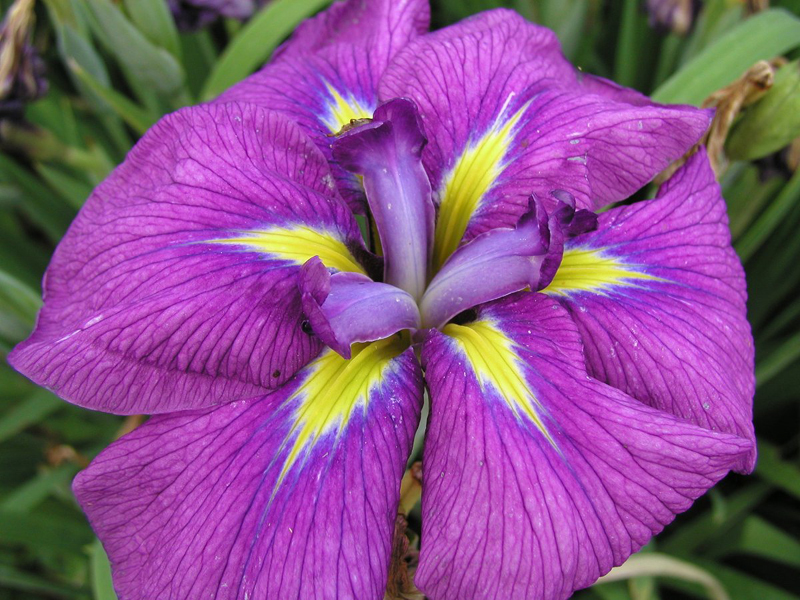

Here are more fine examples of complementary colors at their finest. The colors on this flower stand out more vividly because purple and yellow are opposites on the color wheel! They make the picture stand out and make it more appealing to the eyes, just like the bell pepper photograph. Blue and orange sit opposite each other on the color wheel, thus making this picture pop beautifully, just like the use of orange and blue in Van Gogh’s Café Terrace on the Place du Forum, Arles, 1888.
In Van Gogh’s painting he has a very bold use of colour. If we look at the painting meticulously, we can see how he has used the power of complementary colours and the colour wheel to heighten the visual effect of simultaneous contrast.
Simultaneous contrast is most intense when two complementary colours are juxtaposed directly next to each other. For example, when you place red directly next to green and concentrate on the edge you will see a slight vibration. This is because your eye doesn’t like resting on the edge. The two complementary colour in their purest, most saturated form don’t sit well together, however, if you want to try and focus your viewer's gaze on a particular part of the painting, a knowledge of the ‘attraction to the eye’ can be used to great effect.
Look up your favorite artist or art piece and look at the colors. Compare them to the color wheel. Are some of the colors opposites? Maybe that’s the reason you like a particular piece so much!